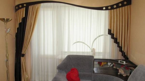
A variety of about the interiors, the glossy magazines about design, many construction shops and boutiques decor, many of which offer ready-made solutions — all this awakens in each person a hidden designer. When there is a repairs — internal Creator unfolds to its full width and often enjoys, making mistakes.
What to avoid in interior design and what are the most frequent errors found in our homes, said the interior designer Igor Musienko and designer-decorator Katherine Sanin.
DO NOT GIVE TO EAT PLACE
Large apartment in a new building or a tiny apartment today categorically rejects the designs of plasterboard. Arches between rooms, buildings of different levels in the ceiling with ornate lighting, niches in the walls or decorative columns and pedestals — all is the maximum allowable locks, but not in urban apartments. Such constructive delights of eating space: the more barriers to sight, the visual, the apartment seems smaller — not to mention the fact that these remnants of the past are looked wildly and functionally useless.
The big question for designers and raise the bar, popular 10 years ago and designed to zone space. Experience shows that they are not zoned, and clutter, preventing the passage and not really performing any function of the Desk (too high), no partition.
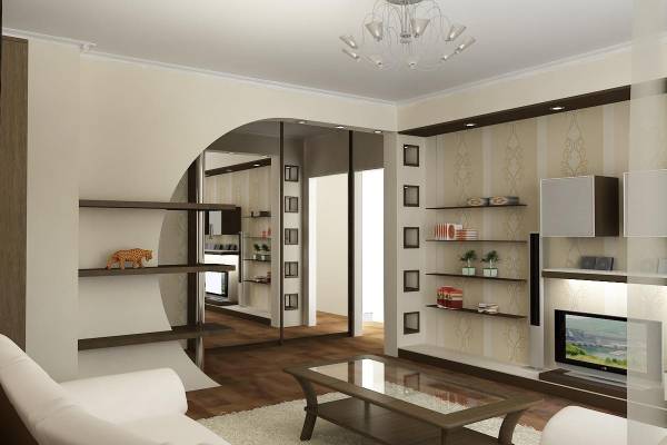
Arch bending space
THE DECOR IS LIKE A CHORD
Each owner or the owner want to exercise your imagination. To limit it, starting with the decor of the Windows. Satin curtains with pelmets are gone. There also went round the folds over the window, thick fringe and iridescent honey satin peeks out of patterned tulle. Today, the trend — curtains direct, heavy, a little longer than the floor (lying on it nice crease). Although styles such as Scandinavian or loft, can go without blinds, only light curtains of organza.
Souvenirs and figurines from different countries were in fashion when abroad was a distant dream, and the decor is from travels served as a source of pride. Today it’s cluttering the living space. Take the trophies small area, preferably in the working area, so as not to clog the guest: use different-sized frames for pictures, a small souvenir pictures with good composition. Avoid open shelves with lots of small details — they create chaos. Shelf for plants, delicate doilies, colored cushions and bedspreads with the tigers take to the country: the principle in the decor — the smaller, the better.
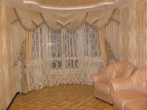
The pelmet. Circular folds of the window — greetings from the past
FURNITURE WITH PASSION
Placed around the perimeter of the room furniture but, in addition to the release of the dance floor in the center. It was hip once: wall unit against one wall, a sofa at the other, two chairs and a table — from a third. It is now fashionable to put in the center of the room sofa: he zoned space, giving it a modern look. Do not occupy the corners of armchairs and chairs: they can be empty, even if you think that’s unusual.
SEE ALSO
- Walls, moss-grown in Ukraine, is gaining popularity new fashion flats
Another common mistake — bulky furniture from natural wood. It is appropriate only for large houses and villas, in small city apartments often looks awkward. Leather upholstery, carved wooden armrests and upholstered furniture surround is only good in huge apartments with a classic design.
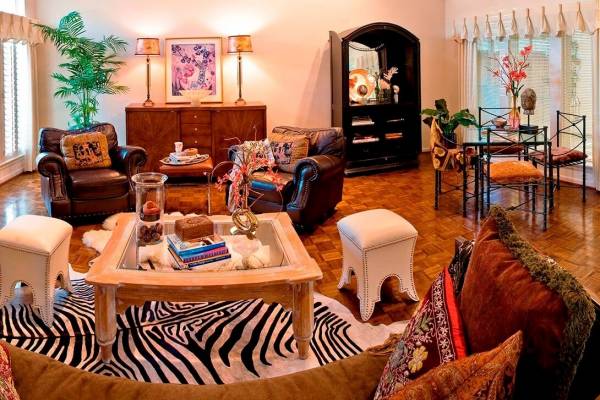
Placement. A lot of furniture in different styles creates chaos
THE LIGHT AROUND THE HEAD
A common mistake that is found in our apartments, one light source. Usually expensive crystal lamp, crown adorning the ceiling. But one light was nice when there was a decent alternative, and the chandelier served as the main decoration of the room.
This means that you can dismantle your family pride is not worth it. But to add a few extra light sources will not prevent. It can be floor lamps, wall lamps or small floor or table lamps contemporary.
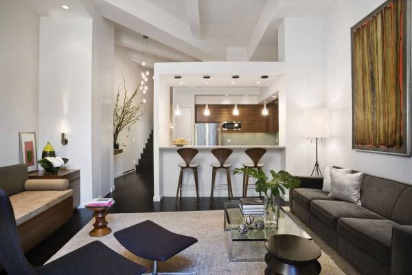
Light does not happen much
FINISHING IS WHAT COUNTS
Avoid monochromatic interior: all white or all blue, it is good for Scandinavian style or Provence. But the style should be followed to the smallest detail. All the rooms in one color — boring and unfashionable: must be the accent wall, color diversity.
Of course, populairste too bad. So follow the simple rule: no more than three colors in the interior. And Wallpaper, and ceilings high gloss that will give your interior a cheap apartment under the cottage from the past.
For those who really wants to paint the walls, designers recommend black-and-white screen printing. But if the suspended ceiling — the only pure white and opaque. Artificial stone as decorative socket from plaster or foam, carved moldings on the walls and bright flowers on the Wallpaper, taken in the decorative frame, all of it looks today as a legacy of cheap chic. In fashion, simple shades, painted or plastered walls and, in extreme cases, neutral Wallpaper.


